

Published on Nov 02, 2026

Super Admin
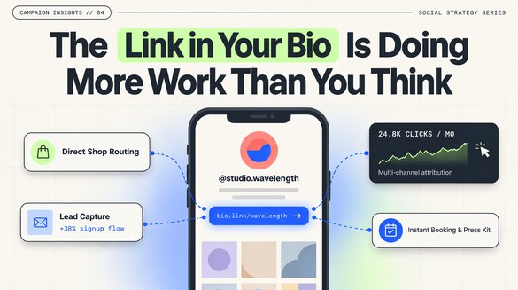
The Link in Your Bio Is Doing More Work Than You Think
Someone watches a thirty-second video, likes what they see, and taps through to the creator’s profile. At that point, the hard part is over: the person is interested. But whether that interest becomes a booking, a sale, a newsletter signup, or another missed opportunity often comes down to a single line on the profile: the link in bio.
That tiny piece of real estate has become a front door for everyone from independent artists to fitness instructors and small businesses. The best version is not necessarily the one with the most buttons. It is the one that helps a visitor find the next thing they came for.
Give visitors a reason to click
A bio link works best when it answers a specific question. For a photographer, that might be “Where can I see your portfolio?” For a restaurant, it might be “Where do I reserve a table?” For a musician, it could be “Where can I hear the new release?” The destination should match the promise made in the profile or post that brought the visitor there.
This is why vague labels such as “All my stuff” tend to underperform clearer language. “See recent projects,” “Book a consultation,” or “Listen to the new single” tells someone what will happen next. Even when you offer several destinations, one primary action should stand out.
Build a home for your work, not another list to navigate
A common mistake is sending every visitor to a long, unorganized stack of links. If a person has to sift through old collaborations, expired promotions, and unrelated accounts, the convenience of the bio link disappears. Start with a short introduction and a few destinations that matter right now.
For people who publish across multiple platforms, a link-in-bio service such as Linklay can bring a portfolio, booking link, newsletter, and newest content together on one page. The value is not the page itself; it is removing the extra steps between discovery and action.
A good rule is to imagine that a first-time visitor has ten seconds and no context. Can they tell who you are, what you offer, and where to go? If not, remove clutter before adding another button.
Organize around what people actually want
The right order depends on the audience, not a universal template. A coach might lead with “Book an introductory call,” followed by client results and free resources. A designer might start with selected work, then services and contact details. A local shop might put hours, directions, and online ordering above social channels.
It helps to think in groups: your main offer, proof of your work, and ways to stay connected. Those categories make decisions easier. They also prevent an awkward experience where the most important destination is buried below a dozen social icons.
Not every visitor is ready to buy. Give curious newcomers a low-commitment option, such as a useful guide, recent video, or portfolio sample. People who are ready to act should not have to hunt for a booking or checkout link.
Design for the phone someone is actually holding
Most people arrive from a social app on a phone, sometimes while commuting or with poor reception. The page should load quickly, use readable labels, and make taps easy. A strong profile photo or recognizable logo is helpful; elaborate animations and oversized backgrounds are optional.
Before sharing a link, open it on a different phone or in a private browser window. Follow every destination. Watch for buttons that are too close together, text that disappears against the background, and pages that ask for a desktop-sized form. An attractive page is useful only if people can finish the task.
Make trust part of the experience
A social profile is a public invitation, so visitors should be able to recognize where each button will take them. Label shopping, booking, donation, and newsletter links honestly. Keep old links from redirecting people to unrelated pages, and avoid displaying personal contact details that were meant to stay private.
The same applies to sponsored recommendations. If a link leads to paid or affiliate content, explain that relationship clearly. When visitors know what to expect, they are more comfortable following through, and creators are less likely to lose trust over a confusing click.
Update the page whenever your priorities change
The strongest bio link is not a one-time design project. It changes with the creator’s work. When a new video launches, make it easy to find. When tickets sell out, remove the old button. When a campaign ends, replace the promotion with something useful instead of leaving a dead end.
Review the page monthly, but also whenever you publish something important. Ask a simple question: if someone discovered me for the first time today, would this page show them the best of what I do right now?
One small link, a better next step
Social platforms are good at helping people discover creators, businesses, and ideas. They are less reliable as a permanent home for all the places an audience might want to go. A thoughtful bio link closes that gap. It offers a clear introduction, a few well-chosen actions, and a path forward that remains useful after the original post is gone.
That is the goal: not more links, but fewer reasons for someone who is interested to leave without finding what they came for.

Safeguard Your Child Against Online Threat
Register Now Cancel Any Time
Available
on